


5 Images, 5 Answers
How great is your photography knowledge?

The year 2023 is finally coming to an end. If you've been following our newsletters, you've probably had a lot of knowledge thrown at you so far. The best way to determine whether or not you've picked up a few things would be to take new pictures (obviously) and compare them to your old pictures, the second-best way is to take a test…and that's what we'll be doing today (Don't run away. It's not difficult, I promise 😂)
In this newsletter, you're going to see images that have “faults”. Errors, mistakes. Your job is to find the error in every image.
For example,
What's wrong with the image below?
Answer:
It has poor composition. It doesn't follow the rule of space.
Explanation:
The subject should not be facing and/or moving out of the frame.
This composition is better because the subject has space to move into within the frame.
Now, it's your turn to play.
There will be a little bit of space between the images and the answers to give you time to think.
What's wrong with these images?
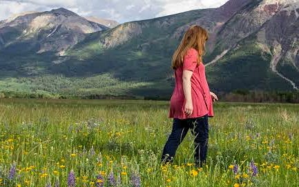
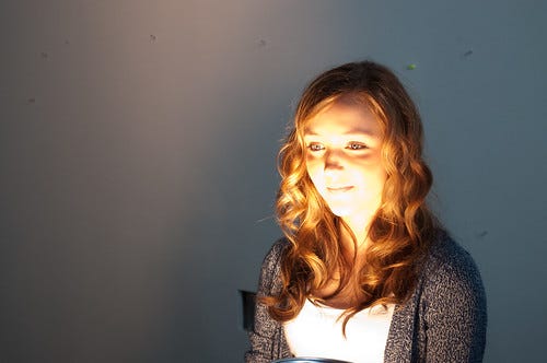
1
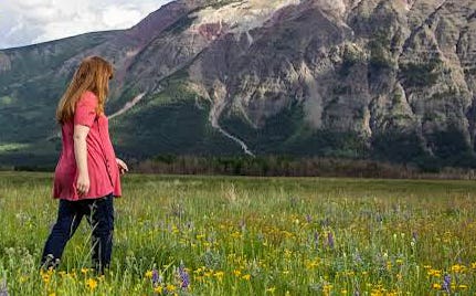
2

3

4

5

Answer: Bad lighting.
Explanation: Notice the bright yellow light on the lower half of her face? It's harsh and unflattering. Using a softer light and placing it in a different position would result in a better picture.
Answer: It's out of focus.
Explanation: Everything in the image is blurry and that makes it hard to even determine what the subject of the image is. Is it the grass? Is it the man? We cannot tell. To avoid this effect when shooting, use a tripod stand or ensure your hands are stable and the image on the screen is focused/clear/sharp before taking a shot.
Answer: It's underexposed.
Explanation: It's almost impossible to make out the details in the image because it's too dim. This can be avoided by using the sun icon ☀ which controls exposure that pops up when you want to take a shot using auto mode. It can also be edited afterwards and brightened by increasing the shadows or exposure.
Answer: It is overexposed.
Explanation: In the top half of the image, the sun and the signboards are too bright. You can correct it by turning down the exposure while shooting or editing (the opposite of the underexposed explanation above).
Answer: Low contrast.
Explanation: The fog lightens and whitens every part of the image and makes it difficult to make out details because everything looks similar. You can correct this in post-processing by using the contrast slider, dehaze slider or by adjusting the black and white sliders to increase or decrease their values.
And that's it!
5 images, 5 answers.
How did you do?
If you got less than 3 right, then that's your cue to revisit our newsletters and practice and improve your photography skills by taking pictures.
It is also important to note that some of these pictures were taken deliberately (pictures 2 and 4). They don't follow the rules of photography, yes, but sometimes the rules can be broken as a stylistic choice (some, not all).
In order to break the rules properly, however, you need to know and understand them first.
So take your time, read, practice, practice and practice.
Today, I leave you with a joke:
“How did the camera know that the water bottle stole all of his photos?”
He left a watermark!
We covered composition, the exposure triangles, lighting and lightroom in these newsletters.
Edit with a photographer here.
The Tale of a Meal by ShotbyMuktarah
·
My vision for this image was to tell the story of where all meals begin—the market, with a focus on vegetables. To achieve this, I opted for a frame-filling shot of a vegetable stand with the market set as the background, and with this; I narrate the tale of
And as always, follow our social media platforms for inspiration, motivation and knowledge.

Instagram:
Twitter:
✍️Sumayyah, A.